
30 Restaurant Website Concepts for 2026 (With the Code Behind Them)
Most restaurant sites still look like they were built from the same three components: a full-bleed hero photo of a plated dish, a “Reserve a Table” button in a rounded pill, and a PDF menu nobody can read on a phone. None of that tells you what it feels like to actually sit down and eat there. A steakhouse and a ramen counter end up with the same layout, the same cream background, the same serif headline, just with different stock photography dropped in.
The thirty concepts below are built the opposite way: starting from the food, the room, and the ritual of eating at that specific kind of place, then working outward to color, type, and interaction. Each one includes the palette as real hex values, a typeface pairing, the layout logic, and a working HTML/CSS snippet you can drop into a project and adapt. None of these are finished sites — they’re starting points specific enough that you couldn’t swap one restaurant’s design onto another without it looking wrong, which is the actual test of whether a design is doing its job.
A note on the code: every snippet is trimmed to the one technique that matters for that design, not a full page. Add vendor prefixes, fallbacks, and reduced-motion handling before shipping anything with animation — a few of the tips call this out directly where it matters most.
1. Ren — Omakase Sushi Counter
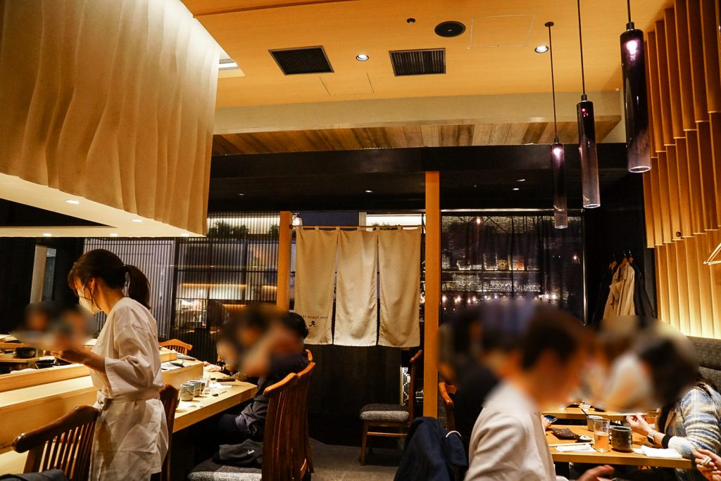
Twelve seats, one chef, no menu on the wall because the menu is whatever came in that morning. The site should feel like sitting at the counter: quiet, sequential, nothing competing for attention. The hero is a single frame of nigiri on cedar, no text overlay, and the course list runs down the page one dish at a time like courses actually arrive.
Palette: ink #14181A · washi paper #F7F5F0 · wasabi #7A8B5C · seal red #B23A2F Type: Shippori Mincho for course names, IBM Plex Sans for everything else
The category labels run vertically along the left edge of each course, the way a menu board reads in a Kyoto counter shop, using writing-mode instead of a rotated transform so the text stays crisp.
.course-label {
  writing-mode: vertical-rl;
  text-orientation: mixed;
  font-family: "Shippori Mincho", serif;
  letter-spacing: 0.15em;
  color: var(--ink);
  border-right: 1px solid var(--seal-red);
  padding-right: 0.75rem;
}
Code tip: writing-mode: vertical-rl handles line-breaking correctly for CJK-adjacent typefaces, which transform: rotate(90deg) doesn’t — rotated text keeps its horizontal line-wrapping logic and looks wrong the moment a label runs long.
Twelve seats also means the booking flow can’t be a generic date picker with unlimited slots — it should show the actual number of remaining seats for each sitting, dropping to zero and closing instead of letting someone request a table that doesn’t exist. On a phone, the vertical labels collapse to a simple horizontal strip above each course rather than trying to preserve the rotation at a width where it would just look cramped.
2. Ash & Oak — Texas Smokehouse
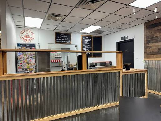
Twelve-hour brisket doesn’t photograph fast, so the site shouldn’t move fast either. Heavy type, a background that reads like scorched wood grain rather than a stock texture, and a smoker temperature readout in the header that just says what’s on the pit right now — “Brisket: hour 9 of 14” — updated by hand each morning.
Palette: charred oak #2B211B · smoke grey #8C8577 · brisket red #A3311C · mustard #D9A441 · bone white #EDE6D6
Type: Alfa Slab One for the wordmark and section heads, Barlow for body copy
The woodgrain isn’t a JPEG — it’s an SVG turbulence filter over a flat color, which stays sharp at any screen size and loads instantly.
<svg width="0" height="0">
  <filter id="woodgrain">
    <feTurbulence type="fractalNoise" baseFrequency="0.012 0.09" numOctaves="4" seed="7"/>
    <feColorMatrix type="matrix" values="0 0 0 0 0.17  0 0 0 0 0.13  0 0 0 0 0.1  0 0 0 0.25 0"/>
  </filter>
</svg>
<div class="hero" style="filter: url(#woodgrain)"></div>
Code tip: SVG filters render at native resolution on every device, so a grain texture built this way never looks pixelated on a 4K monitor the way an upscaled background image would.
The pit readout is a plain text field in whatever CMS runs the site, updated by a pitmaster on a tablet before the doors open — not a sensor feed, which would be overkill for a single line that just needs to be true and current. The takeout counter gets a separate, stripped-down menu view with larger type and higher contrast against the charred-oak background, built for someone glancing at a screen while waiting on a to-go order rather than sitting and reading at leisure.
3. Maison Verte — Parisian Bistro
DESIGNED BY DESIGN ORIGINALS
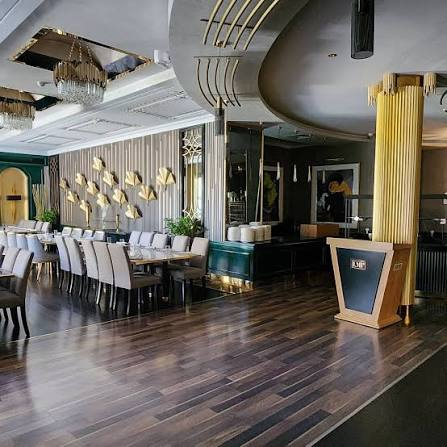
Not the bright, airy version of a Paris bistro — the dark green one, brass rail, mirrored back wall, a menu written in a hand that changes slightly week to week. Copy is kept short and unbothered, in the way a bistro menu just states “confit de canard” and trusts you to know or ask.
Palette: bottle green #1F3A2E · brass #B08D57 · linen #F1ECE0 · wine #6B1E2A
Type: Gilda Display for headings, Karla for body
Menu links get an underline that draws in from the left on hover, in brass, rather than a color change — it reads as a maître d’ pointing at the line, not a button state.
.menu-link {
  position: relative;
  color: var(--linen);
  text-decoration: none;
}
.menu-link::after {
  content: "";
  position: absolute;
  left: 0; bottom: -2px;
  width: 100%; height: 1px;
  background: var(--brass);
  transform: scaleX(0);
  transform-origin: left;
  transition: transform 0.35s ease;
}
.menu-link:hover::after { transform: scaleX(1); }
Code tip: Animating transform: scaleX() instead of width keeps this on the GPU compositor thread, so the underline stays smooth even on an underpowered tablet at the host stand.
The menu itself lives as plain text in a single editable field rather than a rigid template of name, price, description columns — a bistro’s chalkboard changes shape from week to week, sometimes losing the description entirely for a dish everyone already knows, and the layout should absorb that instead of forcing every line into an identical structure. A small language toggle in the corner switches labels between French and English without reloading the page, useful for a neighborhood with both regulars and tourists finding it for the first time.
4. Forno Rosso — Neapolitan Pizzeria
DESIGNED BY DESIGN ORIGINALS
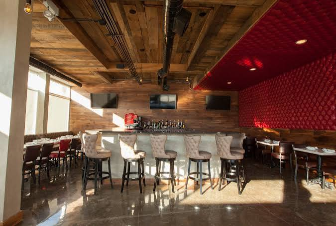
A wood-fired oven runs at 900°F and a pizza is done in ninety seconds — the site should have that same urgency. Big, cropped type, a hand-scrawled chalk accent for daily specials, and menu cards with a torn-paper edge instead of a clean rectangle, like they were pulled off a chalkboard.
Palette: volcanic red #C1440E · basil #3D5A3D · mozzarella #FBF8F1 · charcoal #2A2622 · chalk yellow #E8C547
Type: Big Shoulders Display for headlines, Caveat for the daily-special scrawl, Work Sans for body
.menu-card {
  clip-path: polygon(
    0% 4%, 3% 0%, 12% 3%, 25% 0%, 40% 3%, 55% 0%, 70% 2%, 88% 0%, 100% 5%,
    100% 96%, 96% 100%, 82% 97%, 68% 100%, 52% 97%, 38% 100%, 20% 97%, 5% 100%, 0% 95%
  );
  background: var(--mozzarella);
}
Code tip: Keep the same clip-path polygon on two or three card variants rather than generating a new one per card — a repeated jagged edge still reads as “torn paper,” and one shape means one set of coordinates to maintain.
Ordering for pickup is a single tap on a pizza’s name rather than a multi-step form, since most of the traffic on a pizzeria site is someone deciding in the time it takes an oven to heat up. The volcanic red and mozzarella white pairing is deliberately high-contrast so the menu stays legible on a cracked phone screen in bright daylight outside the shop, which is a more common reading condition for this kind of site than a dim living room at night.
5. Cheol — Korean BBQ, Grill Your Own
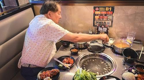
The table is the centerpiece, not the food on a plate — a recessed grill in the middle, banchan around the edge. The menu page mirrors that: a circular grid with the meat cuts arranged around a center hub, radiating out the way panchan bowls actually sit on the table.
Palette: steel #4A4E52 · charcoal #1C1C1C · ember orange #E85D2C · stainless #C9CDD0 · kimchi red #B7291F
Type: Space Grotesk for headings, IBM Plex Mono for cut names and prices — mono gives the price list the look of a temperature readout.
.grill-grid {
  display: grid;
  grid-template-columns: repeat(6, 1fr);
  grid-template-rows: repeat(6, 1fr);
  place-items: center;
}
.grill-center {
  grid-column: 3 / 5;
  grid-row: 3 / 5;
  border-radius: 50%;
  background: radial-gradient(circle, var(--ember-orange), var(--charcoal) 80%);
}
Code tip: Building the “grill” as a real grid rather than absolutely-positioned circles means the layout reflows sanely on mobile — collapse it to grid-template-columns: 1fr at your smallest breakpoint instead of trying to preserve the circle.
Because portions are usually ordered per person rather than per dish, a party-size stepper above the cut list adjusts the suggested quantity for each item instead of leaving the guest to do that math themselves. Raw cuts meant for the grill and pre-cooked side dishes get a distinct visual marker rather than living in the same undifferentiated list, since mixing them up on a table with an open flame is a genuinely different kind of mistake than mixing up a burger order.
6. Root & Bloom — Vegan Café
Produce-forward, unfussy, photographed on unbleached linen instead of black slate. Dish photos are cropped into leaf-shaped masks instead of rectangles for the seasonal specials section — a small detail that stops the grid from looking like every other café site’s Instagram feed embed.
Palette: fern #3F5E3A · oat #E9E2D0 · clay pink #D7A98C · sprout #8FAF6E
Type: Newsreader (italic) for dish names, Work Sans for descriptions
.dish-photo {
  -webkit-mask-image: url("leaf-mask.svg");
  mask-image: url("leaf-mask.svg");
  -webkit-mask-size: contain;
  mask-size: contain;
  -webkit-mask-repeat: no-repeat;
  mask-repeat: no-repeat;
}
Code tip: Export the mask SVG with a single solid black shape and no strokes — gradients or multiple fills inside a mask source get flattened unpredictably across browsers, and a clean silhouette is the only thing that renders consistently.
Allergen and diet filters sit as plain checkboxes reachable by keyboard alone, not a dropdown that requires a mouse to open — this matters more here than almost anywhere else on this list, since the entire audience for a vegan café is already filtering their choices before they arrive. A small seasonal badge on each dish notes which produce is currently local, sourced from the same field that drives the farm-to-table site further down, so the claim is specific rather than a permanent green leaf icon slapped on everything.
7. Yūgure — Ramen Shop
DESIGNED BY DESIGN ORIGINALS
Steam is the whole mood of a ramen counter on a cold night. A soft looping animation of rising steam sits behind the hero type, built from blurred, animated divs rather than a video file, so it costs almost nothing to load.
Palette: broth amber #C98A3B · noren indigo #2B3A55 · steam white #F4F1E8 · char red #8C2F2F
Type: Zen Old Mincho for the shop name, Noto Sans JP for menu text
.steam {
  position: absolute;
  width: 40px; height: 120px;
  background: var(--steam-white);
  filter: blur(14px);
  opacity: 0;
  animation: rise 6s ease-in infinite;
}
@keyframes rise {
  0%   { transform: translateY(0) scaleX(1);   opacity: 0; }
  20%  { opacity: 0.5; }
  100% { transform: translateY(-160px) scaleX(1.6); opacity: 0; }
}
Code tip: Stagger three or four of these divs with different animation-delay values instead of one — a single steam column reads as a glitch, but three overlapping and offset reads as continuous rising steam.
Anyone who’s sensitive to motion shouldn’t have looping steam fighting for attention behind the text they’re trying to read, so the whole animation checks prefers-reduced-motion and falls back to a static, softly blurred graphic when that’s set. Below the fold, a simple current wait-time line, updated by staff between rushes, does more for a walk-in ramen counter than any amount of atmospheric styling — people checking the site before a cold walk over mostly want to know if there’s a line.
8. The Gilded Owl — Speakeasy Cocktail Bar
DESIGNED BY DESIGN ORIGINALS
No sign on the street, so the site is the sign. A dark, art-deco fan pattern behind the reservation form, built with a single conic gradient rather than an image, keeps the geometric repeat crisp at any zoom level.
Palette: aubergine #2E1A24 · gold leaf #C9A24B · smoke #4B4453 · garnet #6E1F2B
Type: Cinzel Decorative for the wordmark, Marcellus for menu and body
.deco-fan {
  background: conic-gradient(
    from 0deg,
    var(--gold-leaf) 0deg 4deg,
    transparent 4deg 20deg
  );
  background-position: center;
}
Code tip: Tune the 4deg/20deg split, not the color stops, to change how dense the fan pattern feels — it’s the fastest lever for making the same gradient read as delicate or bold.
Because the whole premise is discretion, private room bookings run through a separate, unlisted calendar link rather than sitting on the main reservation form where every visitor sees it. A simple age confirmation step before the menu loads is styled to match the rest of the site instead of looking like a bolted-on legal requirement — a small thing, but a mismatched popup breaks the mood a speakeasy site depends on faster than almost anything else could.
9. Meskel — Ethiopian Restaurant
DESIGNED BY DESIGN ORIGINALS
The meal is communal — one large platter of injera, shared. The layout mirrors that: instead of individual dish cards, dishes are grouped into a single “platter” section per course, described together the way they’d actually arrive at the table. A woven basket pattern borrowed from mesob serving trays runs along section dividers.
Palette: indigo #2C3E66 · saffron gold #D8A93E · berbere red #A3372A · ivory #F0E9DA
Type: Spectral for headings, Mulish for body
.mesob-divider {
  height: 24px;
  background-image: repeating-linear-gradient(
    45deg, var(--saffron) 0 8px, var(--berbere-red) 8px 16px
  ),
  repeating-linear-gradient(
    -45deg, var(--indigo) 0 8px, transparent 8px 16px
  );
  background-blend-mode: multiply;
}
Code tip: background-blend-mode: multiply on two overlapping repeating-linear-gradient layers gives a woven look that a single gradient can’t — each layer keeps its own angle, so the crossing threads actually look crossed.
Since the platter is sized for a group rather than an individual, the booking form asks for party size up front and adjusts the recommended platter size in response, rather than making every guest work out portioning themselves. Dish names that aren’t widely known outside the cuisine get a small, dismissible note on first hover explaining what they are — a glossary that appears once and then gets out of the way, instead of a permanent tooltip icon cluttering every single item.
10. Cellar Door — Natural Wine Bar
DESIGNED BY DESIGN ORIGINALS
The wine list changes weekly depending on what came in, so the site treats bottles like a collage of hand-labeled finds rather than a formal list. Labels are shown at a slight rotation, like they’re laid out on a tasting table, and a custom cursor shaped like a wine glass follows the pointer over the list.
Palette: sediment plum #4A2E3B · straw #D8C27A · glass green #7C9A82 · label cream #EFE8DA
Type: Instrument Serif (italic) for bottle names, Archivo for tasting notes
.wine-list {
  cursor: url("glass-cursor.svg") 12 24, auto;
}
.bottle-card:nth-child(odd)  { transform: rotate(-1.2deg); }
.bottle-card:nth-child(even) { transform: rotate(1.4deg); }
Code tip: Custom cursors need a small file (under 32×32px ideally) and an explicit hotspot offset — the two numbers after the URL — or the pointer’s click point won’t line up with where the glass appears to be.
The bottle list pulls from a simple spreadsheet the buyer updates directly, since a natural wine list can turn over completely within a week and a hardcoded product catalog would be stale within days of launch. A flight builder lets a guest pick three or four bottles to taste side by side and see a running total before they order, which suits how people actually decide at a wine bar — by comparison, not by browsing one bottle at a time.
11. El Trompo — Street Taco Truck
DESIGNED BY DESIGN ORIGINALS
A truck menu is read fast, standing up, usually with cash in one hand. The site borrows the sticker-and-decal look of the truck’s own paint job: bold outlined type, a horizontal scroll of taco cards that snaps into place like flipping through a stack of order tickets.
Palette: hot pink #E8407A · lime #A8CE3A · cobalt #2653A6 · marigold #F2A93B
Type: Anton for the menu, Poppins for descriptions
.taco-scroll {
  display: flex;
  overflow-x: auto;
  scroll-snap-type: x mandatory;
  gap: 1rem;
}
.taco-card {
  flex: 0 0 80%;
  scroll-snap-align: center;
}
Code tip: scroll-snap-align: center (not start) keeps the active card visually centered with a peek of the next one on both sides, which reads better on a phone than a card snapped flush to the edge.
12. Starlite Diner — Retro American Diner
DESIGNED BY DESIGN ORIGINALS
Chrome trim, a checkerboard floor, a jukebox humming somewhere. The neon sign in the hero is real CSS, not an image — layered text-shadow values build up the glow the same way a physical neon tube layers light.
Palette: chrome #C7CDD1 · cherry #C7233F · mint #7FC6B6 · black #1A1A1A · neon yellow #F2E63D
Type: Bungee for the sign, DM Sans for the menu
.neon-sign {
  color: #fff;
  text-shadow:
    0 0 4px #fff,
    0 0 10px var(--neon-yellow),
    0 0 20px var(--neon-yellow),
    0 0 40px var(--cherry);
}
Code tip: Build the glow from smallest blur radius to largest, in that order — reversing the stacking order makes the outer glow overpower the crisp inner edge, and the sign reads as blurry instead of lit.
13. Hearth & Harvest — Farm-to-Table
DESIGNED BY DESIGN ORIGINALS
The menu changes with what the farm delivered that morning, so the site’s color accent shifts by season instead of staying fixed — set once via a data attribute, not hardcoded per page. Winter runs on soil brown, summer shifts the same layout toward leaf green.
Palette: soil #4A3B2C · harvest gold #C98A2E · leaf #5C7A4A · cream #EDE5D3
Type: Domine for headings, Karla for body
:root[data-season="summer"] { --accent: #5C7A4A; }
:root[data-season="autumn"] { --accent: #C98A2E; }
:root[data-season="winter"] { --accent: #4A3B2C; }

.section-eyebrow { color: var(--accent); }
Code tip: Setting the season as a data- attribute on the root element, rather than a class, keeps the CSS specificity flat and lets a single line of server-rendered HTML swap the entire palette without touching any component code.
14. Jade Basket — Dim Sum Teahouse
DESIGNED BY DESIGN ORIGINALS
Dumplings arrive in stacked bamboo steamers, so the dish grid is circular, arranged in rows like steamers stacked on a cart, rather than square product cards. A small red seal graphic marks the chef’s picks, borrowed from the stamped seal on a teahouse receipt.
Palette: jade #3E7A5D · vermilion #B8383B · bamboo tan #D9C79E · porcelain #F5F1E6
Type: Cormorant Garamond for dish names, Jost for prices and notes
.steamer {
  aspect-ratio: 1 / 1;
  border-radius: 50%;
  border: 6px solid var(--bamboo-tan);
  overflow: hidden;
}
.steamer img { width: 100%; height: 100%; object-fit: cover; }
Code tip: aspect-ratio: 1 / 1 combined with object-fit: cover keeps every steamer photo perfectly circular regardless of the source image’s dimensions, without needing to pre-crop every dish photo to a square.
15. Nonna’s Table — Rustic Trattoria
DESIGNED BY DESIGN ORIGINALS
Handwritten on a board that gets erased and rewritten nightly. The digital menu mimics that with a hand-lettered display face for dish names and a warm backdrop blur behind the daily specials panel, as if it’s a chalkboard photographed through the restaurant’s front window.
Palette: olive #6B7648 · wheat #D8C48C · tomato #B5432E · cream #F2ECDB
Type: Alegreya for headings, PT Sans for body
.specials-panel {
  backdrop-filter: blur(6px) saturate(1.1);
  background: rgba(242, 236, 219, 0.6);
  border: 1px solid var(--wheat);
}
Code tip: Pair backdrop-filter with a semi-transparent background color, not a fully transparent one — without it, the blur has nothing to sit on top of and the panel edge looks unfinished on browsers that support the property inconsistently.
16. Casa Marigold — Mexican Cantina
DESIGNED BY DESIGN ORIGINALS
Papel picado banners strung across the ceiling on a festival night. A scalloped, cut-paper edge runs along the page’s section dividers instead of a straight line, echoing the punched-paper pattern without literally showing a banner graphic.
Palette: marigold #F2A93B · cobalt #1F4E8C · magenta #C23B6B · papel white #F7F4EC
Type: Baloo 2 for headings, Nunito for body
.papel-divider {
  height: 40px;
  background: radial-gradient(circle, transparent 60%, var(--papel-white) 61%)
    repeat-x;
  background-size: 40px 40px;
}
Code tip: Adjust the 60%/61% split in the radial gradient to change scallop size without touching background-size — moving both at once tends to introduce visible seams between repeats.
17. Dhaba No. 7 — Indian Curry House
DESIGNED BY DESIGN ORIGINALS
A roadside dhaba menu reads like a spice list before it reads like a menu — cardamom, chili, turmeric named up front. Dish cards use a block-print pattern along the border, inspired by hand-stamped textile printing rather than a generic damask.
Palette: saffron #E0952B · cardamom green #37633F · chili red #B3271E · ivory #F1E8D2 · indigo #2A3A5C
Type: Rozha One for dish names, Mukta for descriptions
.dish-card {
  --spice: var(--chili-red);
  border: 3px solid var(--indigo);
  transition: border-color 0.4s ease;
}
.dish-card:hover { border-color: var(--spice); }
.dish-card.mild    { --spice: var(--cardamom-green); }
.dish-card.medium  { --spice: var(--saffron); }
.dish-card.hot     { --spice: var(--chili-red); }
Code tip: Driving the hover color through a custom property (--spice) set per spice-level class, rather than three separate hover rules, means adding a fourth spice tier later is a one-line change instead of a new selector.
18. Levant & Vine — Mediterranean Mezze Bar
DESIGNED BY DESIGN ORIGINALS
Small plates meant for sharing, whitewashed walls, olive branches on the table. Photos run through a light sepia/contrast filter combination to match the sun-bleached whitewash look rather than sitting on top of a plain white background.
Palette: aegean blue #2C5F7C · whitewash #F3F0E9 · olive #6B7A4A · sun ochre #D9A441
Type: Cormorant for headings, Jost for body
.mezze-photo {
  filter: sepia(0.15) contrast(1.05) brightness(1.03);
}
Code tip: Keep filter values this subtle — sepia(0.15), not sepia(0.6) — the goal is a warm cast that still reads as a real photo, not an Instagram filter slapped over food.
19. Lyng — New Nordic Tasting Menu
DESIGNED BY DESIGN ORIGINALS
A tasting menu built around what was foraged that week. As the visitor scrolls through the courses, small pins marking where each ingredient came from fade in on a simple line-drawn map, tied to scroll position rather than a separate button click.
Palette: birch white #EFEDE6 · lichen #8C9A85 · glacier #B8C6C9 · char #2A2A28
Type: Fraunces (light weight) for course names, Manrope for body
.forage-pin {
  opacity: 0;
  animation: pin-in linear both;
  animation-timeline: view();
  animation-range: entry 10% cover 40%;
}
@keyframes pin-in { to { opacity: 1; } }
Code tip: animation-timeline: view() ties the animation to scroll position without any JavaScript, but it’s a newer CSS feature — wrap it with a @supports check and fall back to the pins simply being visible by default in browsers that don’t support it yet.
20. Fogo Roda — Brazilian Churrascaria
DESIGNED BY DESIGN ORIGINALS
The rodizio wheel is the whole concept: waiters circle with skewers until you flip a card from green to red. The menu section literalizes that with a rotating wheel of cuts, styled as slices of a circle, that spins slowly and pauses on hover.
Palette: fire orange #D9481E · hide brown #6B4A2E · ember yellow #E8A23B · char #221A16
Type: Staatliches for headings, Barlow Condensed for body
.rodizio-wheel {
  animation: spin 40s linear infinite;
}
.rodizio-wheel:hover { animation-play-state: paused; }
@keyframes spin { to { transform: rotate(360deg); } }
Code tip: animation-play-state: paused on hover is far cheaper than stopping and restarting the animation with JavaScript, and it resumes from the exact same rotation angle instead of jumping.
21. Phở Lụa — Vietnamese Pho Shop
DESIGNED BY DESIGN ORIGINALS
The broth is simmered for a day before service, and the site’s hero mirrors that patience — a still photo of the pot with a soft lacquer-red sheen layered over it using a blend mode, rather than a busy animated steam effect competing with the ramen shop’s approach above.
Palette: broth gold #C99A3E · lacquer red #A32A2A · lotus pink #E8B7C4 · jade #3E6B54
Type: Literata for headings, Be Vietnam Pro for body
.hero-photo {
  position: relative;
}
.hero-photo::after {
  content: "";
  position: absolute; inset: 0;
  background: linear-gradient(120deg, var(--lacquer-red), transparent 60%);
  mix-blend-mode: overlay;
}
Code tip: mix-blend-mode: overlay on a gradient pseudo-element lets the sheen react to the photo’s own light and dark areas instead of flattening it — a plain opacity-based overlay would just look like a tinted film over the top.
22. Zaytoon Spit — Middle Eastern Shawarma Spot
DESIGNED BY DESIGN ORIGINALS
The spit turns all day. The page’s loading state literalizes that rather than using a generic spinner — a small rotating skewer icon that plays while content loads, so even the wait feels on-brand instead of like dead time.
Palette: brass #B08D4E · desert sand #D9C7A0 · pomegranate #A32A3B · indigo tile #2E4A6B
Type: Amiri for headings, Cairo for body
.spit-loader {
  width: 32px; height: 32px;
  background: conic-gradient(var(--brass) 0deg 270deg, var(--desert-sand) 270deg 360deg);
  border-radius: 50%;
  animation: turn 1.2s linear infinite;
}
@keyframes turn { to { transform: rotate(360deg); } }
Code tip: Keep loader animations under a second and a half per cycle — anything slower reads as the page being stuck rather than working, even if the content actually finishes loading before the first full rotation.
23. Yolk & Bloom — Brunch Café
DESIGNED BY DESIGN ORIGINALS
Morning light through a window, eggs, soft color. A background gradient shifts gently based on scroll position, moving from a pale dawn blue near the top to a warmer yolk tone by the time you reach the menu — a small touch that mirrors a morning passing.
Palette: sky pastel #BCD8E8 · egg yolk #F2B93B · blush #F0C6C6 · cream #FBF7EE
Type: Bricolage Grotesque for headings, Onest for body
body {
  background: linear-gradient(var(--sky-pastel), var(--egg-yolk));
  background-attachment: fixed;
  background-size: 100% 300vh;
}
Code tip: Setting background-size taller than the viewport and using background-attachment: fixed creates the scroll-tied color shift without any JavaScript or scroll-event listener at all — the browser handles it as part of normal painting.
24. Scoop & Swirl — Gelato Parlor
DESIGNED BY DESIGN ORIGINALS
Playful, a little melty. Flavor cards wobble slightly on hover using an animated border-radius, the closest CSS gets to a soft-serve swirl without needing a canvas animation.
Palette: pistachio #A8C97A · raspberry #E8567B · lemon #F2D93B · milk white #FBF7F0
Type: Fredoka for headings, Nunito for body
.flavor-card:hover {
  animation: wobble 1.6s ease-in-out infinite;
}
@keyframes wobble {
  0%, 100% { border-radius: 42% 58% 63% 37% / 41% 44% 56% 59%; }
  50%      { border-radius: 63% 37% 42% 58% / 59% 56% 44% 41%; }
}
Code tip: Swapping between two opposite border-radius value sets, rather than animating a single corner, is what makes the shape feel like it’s actually flowing rather than just one corner bulging.
25. Ember & Iron — Tapas Bar
DESIGNED BY DESIGN ORIGINALS
Small plates, meant to cover a table in variety rather than sit alone. The menu grid uses a dense masonry layout so a tiny plate of olives and a large board of jamón can share the same row without wasted space around either.
Palette: sherry amber #B8722E · wrought-iron black #211E1B · olive #6B7A4A · clay tile #C0552F
Type: Piazzolla for headings, Karla for body
.plate-grid {
  display: grid;
  grid-template-columns: repeat(auto-fill, minmax(160px, 1fr));
  grid-auto-flow: dense;
  gap: 0.75rem;
}
.plate-card.large { grid-column: span 2; grid-row: span 2; }
Code tip: grid-auto-flow: dense backfills gaps left by the larger cards automatically — without it, a single span 2 card can leave an empty cell that the browser won’t fill even if a smaller card would fit there.
26. Nightglass — Rooftop Bar & Restaurant
DESIGNED BY DESIGN ORIGINALS
A view is the entire pitch. As the visitor scrolls, the skyline behind the menu moves slower than the foreground content, and string lights above blur into soft bokeh dots rather than sharp icons, matching how city lights actually look out of focus at dusk.
Palette: dusk purple #4A3B63 · amber glow #E8A23B · skyline navy #1F2A44 · bokeh gold #F2D18C
Type: Unbounded for headings, Manrope for body
.skyline {
  will-change: transform;
}
.bokeh-light {
  width: 14px; height: 14px;
  border-radius: 50%;
  background: var(--bokeh-gold);
  box-shadow: 0 0 18px 6px var(--bokeh-gold);
  filter: blur(2px);
}
Code tip: Move the skyline layer’s transform: translateY() value in a scroll listener with requestAnimationFrame, not directly in the scroll event — reading and writing layout on every raw scroll tick is what makes parallax effects stutter on lower-end phones.
27. Fork/Lift — Delivery-Only Ghost Kitchen
DESIGNED BY DESIGN ORIGINALS
No dining room, so no dining-room aesthetic to borrow from — the brand looks like the packaging: a duotone magenta-and-cyan treatment over every photo, and an order-status bar that fills like a progress meter, since tracking the food’s location on a map is the entire customer relationship.
Palette: magenta #E8267A · cyan #29C4D9 · ink #16181C · paper white #F2F2F0
Type: Syne for headings, Inter for body
.duotone-photo {
  filter: grayscale(1) contrast(1.1);
  background: linear-gradient(135deg, var(--magenta), var(--cyan));
  background-blend-mode: color;
}
Code tip: background-blend-mode: color only affects hue and saturation, leaving the photo’s original lightness values intact — this is what keeps a duotone photo readable instead of crushing it into two flat blocks of color.
28. Akari Alley — Izakaya
DESIGNED BY DESIGN ORIGINALS
Narrow alley, paper lanterns, the glow spilling onto wet pavement. The header uses layered, colored box-shadow values to fake a lantern’s warm glow around the restaurant name rather than a literal image of a lantern.
Palette: lantern red #B8342E · indigo #2A3A5C · charcoal #211E1C · paper gold #E8C56B
Type: Yuji Syuku for the wordmark, Zen Kaku Gothic New for menu text
.lantern-glow {
  box-shadow:
    0 0 20px 4px var(--paper-gold),
    0 0 60px 20px rgba(232, 197, 107, 0.3);
  border-radius: 999px;
}
Code tip: Use two box-shadow layers with different spread and opacity rather than one large one — a single soft shadow reads as blur, while two stacked at different intensities reads as an actual light source.
29. Tideline — Oyster Bar
DESIGNED BY DESIGN ORIGINALS
The menu follows the tide chart, literally — oysters listed by where and when they were harvested. Section dividers are drawn as a wave rather than a straight rule, built from a single SVG path so it scales cleanly at any width.
Palette: tide grey-blue #5C7286 · pearl white #F2EFE8 · briny green #4A6B5C · shell pink #E8C6C2
Type: EB Garamond (italic) for headings, Lora for body
<svg viewBox="0 0 1200 60" preserveAspectRatio="none" class="wave-divider">
  <path d="M0,30 C300,60 900,0 1200,30 L1200,60 L0,60 Z" fill="var(--pearl-white)"/>
</svg>
Code tip: Setting preserveAspectRatio="none" on the SVG lets the wave stretch to fill any container width without distorting into an awkward shape — normally SVGs resist stretching to protect proportions, which is exactly what you don’t want in a full-width divider.
30. Crumb & Co. — Artisan Bakery
DESIGNED BY DESIGN ORIGINALS
Lamination is the whole craft — dozens of paper-thin layers of butter and dough. The hero shows a cross-section of a croissant rebuilt in pure CSS as stacked, rounded bands, and menu cards “peel” open on hover using a corner-fold transform.
Palette: butter #F2D98C · crust brown #8C5A2E · cream #FBF6EA · berry #A3324A
Type: Yeseva One for headings, Mulish for body
.menu-card {
  perspective: 800px;
}
.menu-card .corner {
  position: absolute; top: 0; right: 0;
  width: 40px; height: 40px;
  background: var(--cream);
  transform-origin: top right;
  transition: transform 0.3s ease;
}
.menu-card:hover .corner {
  transform: rotateY(-25deg) rotateX(15deg);
}
Code tip: The perspective property has to live on the parent element, not the corner itself — put it directly on the piece you’re folding and the 3D rotation flattens out with no depth at all.
Where to go from here
None of these thirty are meant to be copied wholesale onto a restaurant that isn’t the one they were built for — a rotating rodizio wheel makes sense for a churrascaria and would be a strange, distracting choice on a quiet omakase counter. The pattern worth taking from all thirty is the order of operations: start from something specific and true about how that restaurant actually operates — what the kitchen does, what the room feels like, what the regulars already know — and let the palette, type, and one signature interaction follow from that. Everything else on the page, the reservation form, the hours, the address, can stay quiet and out of the way.
The code snippets above are deliberately small enough to test in isolation before wiring them into a full build. Drop one into a blank HTML file, check it against a screen reader and a keyboard-only pass, add prefers-reduced-motion handling around anything that loops or auto-plays, and confirm it still holds up at a 360px viewport width before it goes anywhere near a live menu.